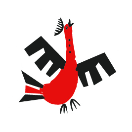
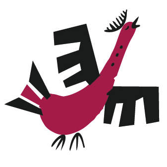
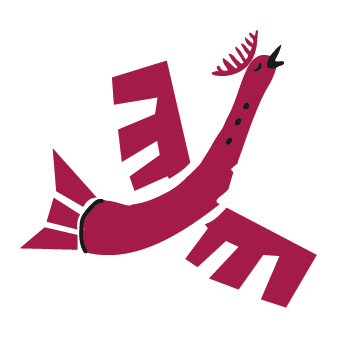
MEZEN
Behind the Scenes of Design Production

Hey everyone and welcome back to our Game Creation series.
Earlier we told you about how the idea of our new release, Mezen, came about. Today let’s talk about further production process in more detail.
The main focus of the game process is on tiles that you flip, slide down, move and… just look at. When you prepare for the game, you need to easily distinguish their form to pick all the corresponding components. When you think on your move, you need to quickly figure out where are horses, but not foxes or birds. What side is the tile up now? Does it form a group with those ones?
All these things are supposed to happen quite quickly in your mind, your eye should grasp what’s needed and move on to further tasks.
You do not usually think about such details when you play, unless it is made poorly. And by “it” we mean design.
(Not game design in general, but artwork, design of tiles – form, size, colour, etc.)
There were several major decisions to be made on the visual aspect of the game:
SYMBOLS
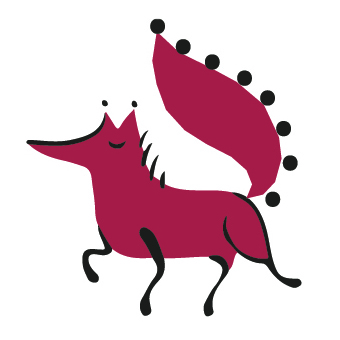
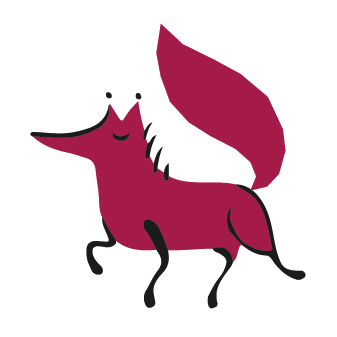
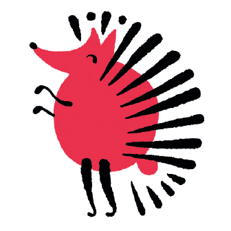
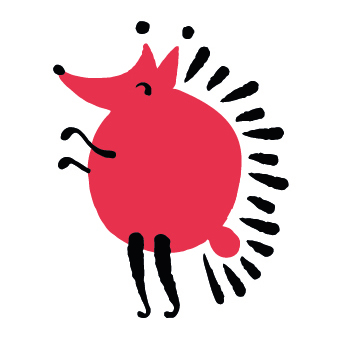
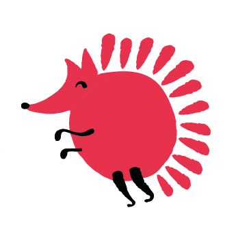
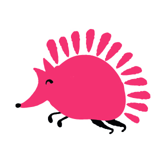
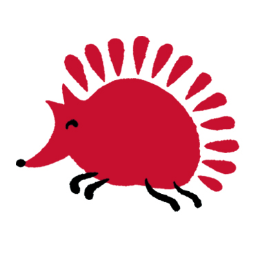
From the first design of each symbol to the final one there were at least 10 different options – from slight changes to major redesign.
At first, except from the animal itself, tile design contained frames, ornaments, day/night symbols and whatnot. The balance between too much details and too plain image was achieved through trial and error.
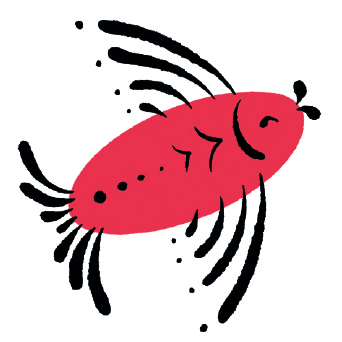
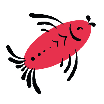
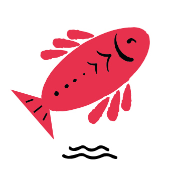
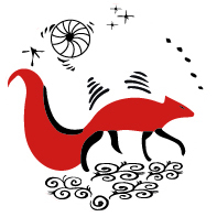
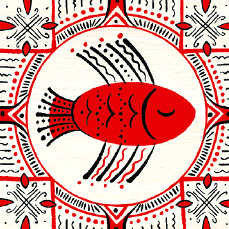
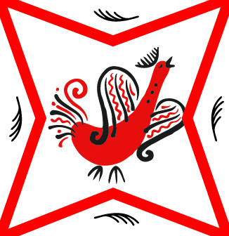
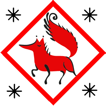
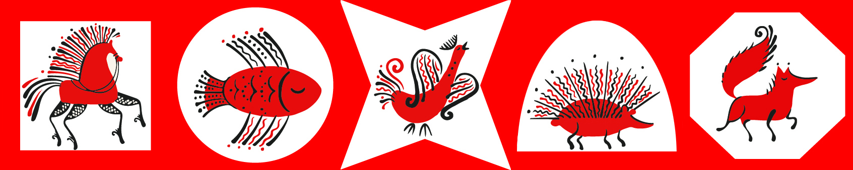
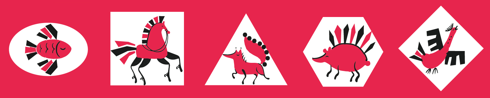
Here is the evolution of each animal from the very first design to its final cut.
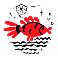
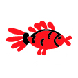
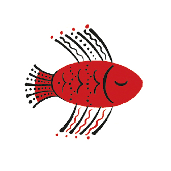
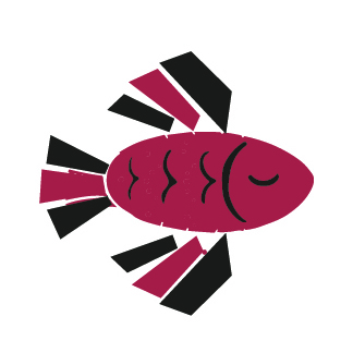
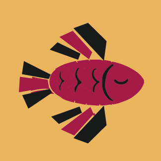
Fish


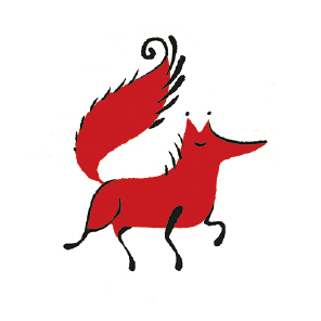
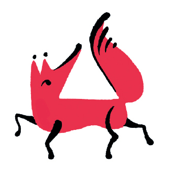
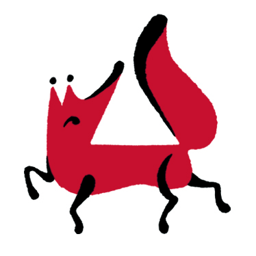
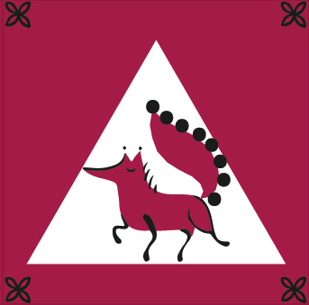
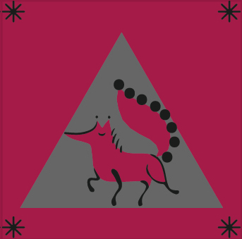
Fox


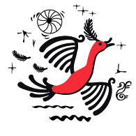
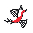
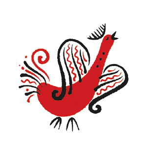
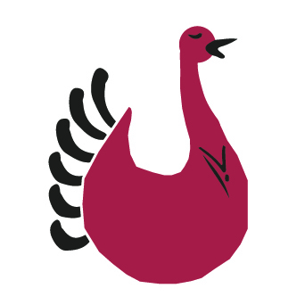
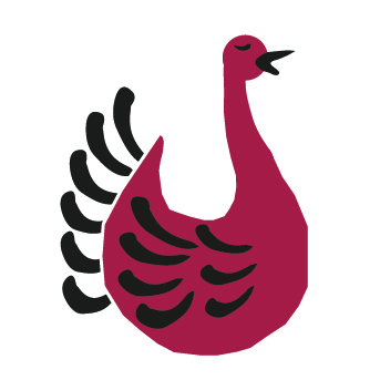
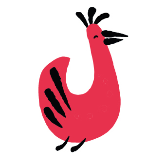
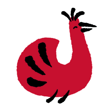
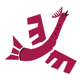
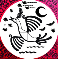
Bird


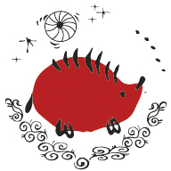
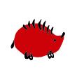
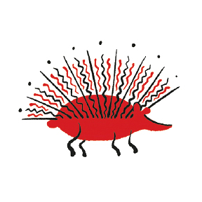
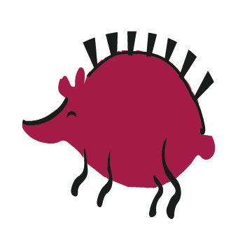
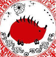
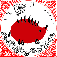
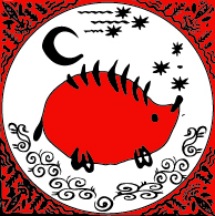
Hedgehog


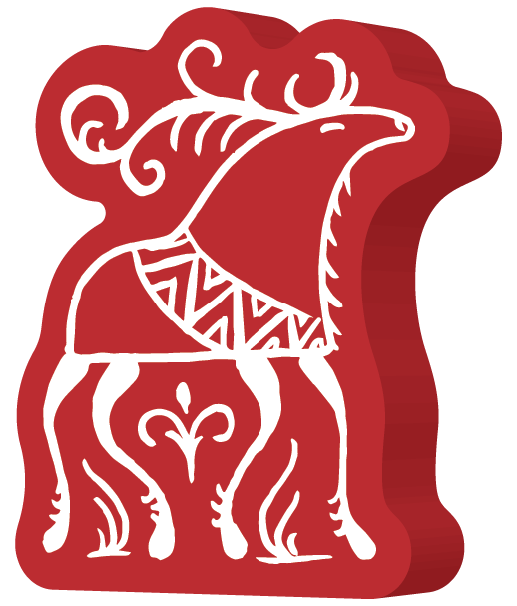
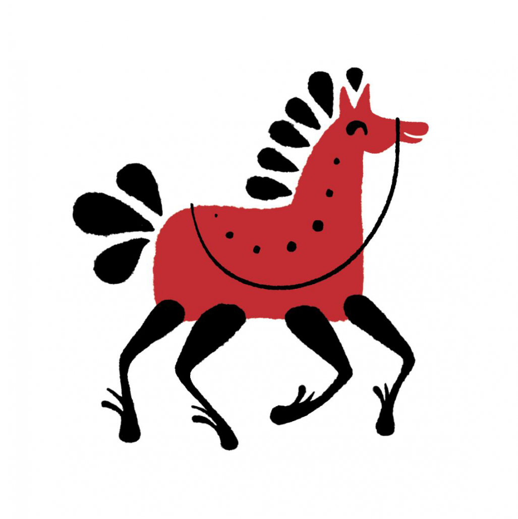
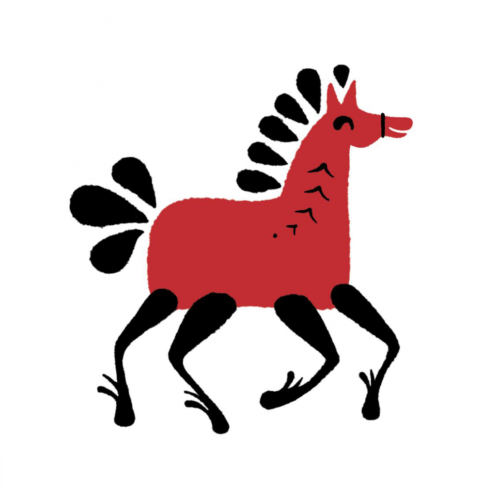
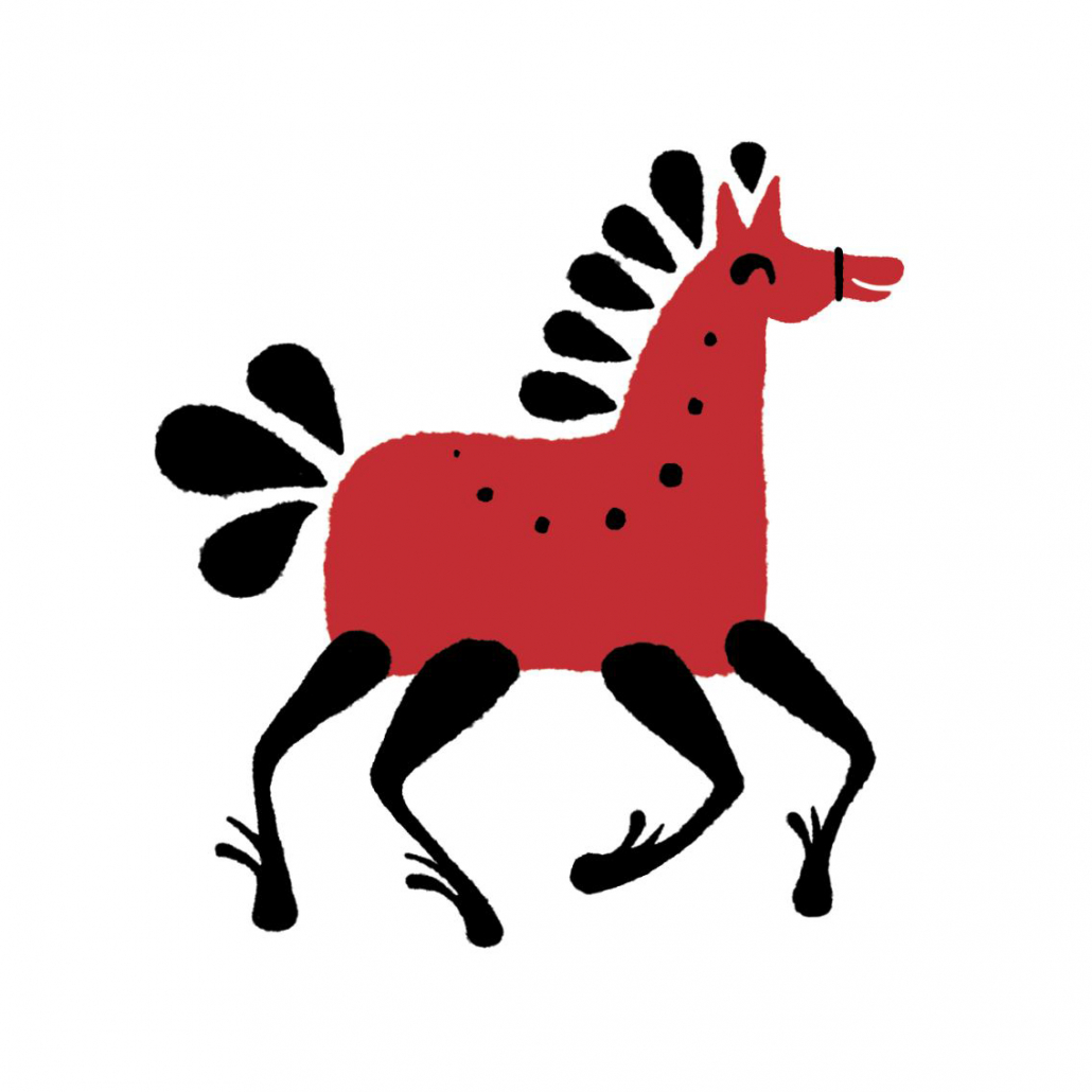
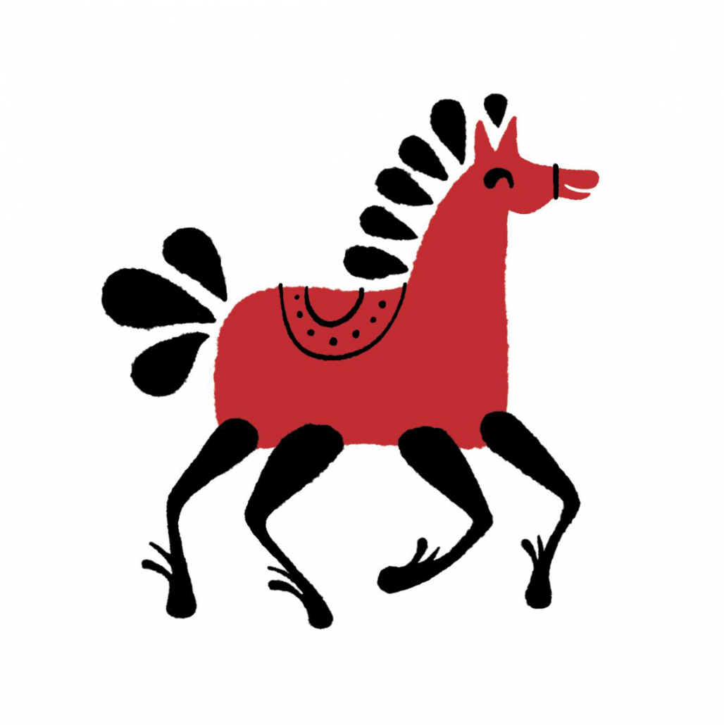
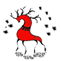
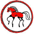
Horse
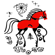
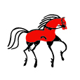
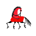
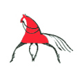
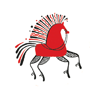
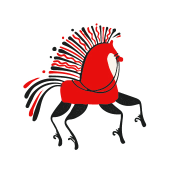
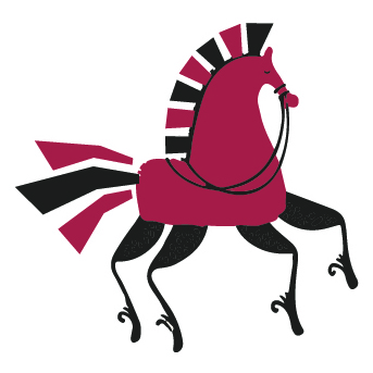
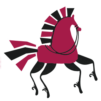
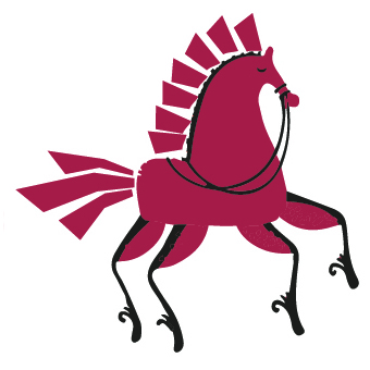
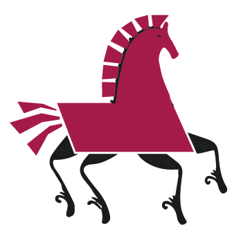
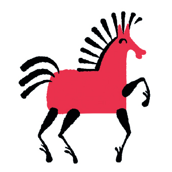
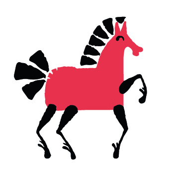
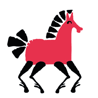
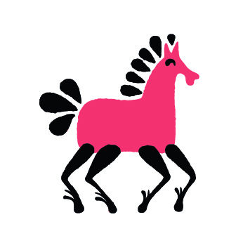
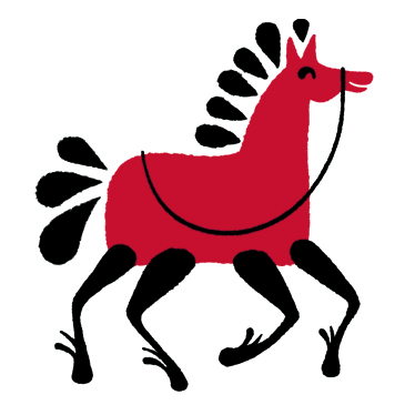
The horse was sort of a lab rat and has come through more changes than any other tile. Even at the final stage its design was still undecided.


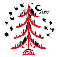
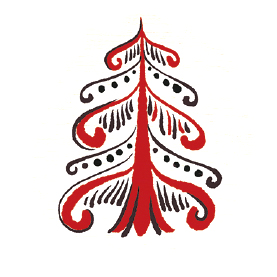
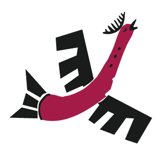
The Spruce tile, which is kind of a Joker in the game, also has come through several changes: from a reindeer to a spruce, then to a ship and to the spruce again.


DETAILS
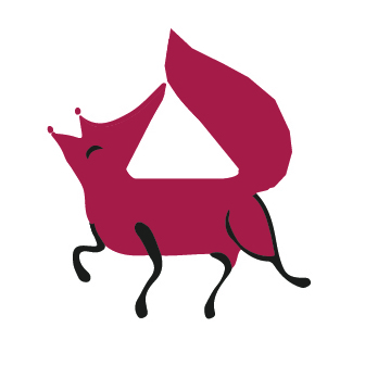
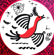
Except for the animal design itself, the tiles on certain stages contained frames and additional symbols, which were not only meant to serve a decorational purpose, but also to distinguish between different sides of the tiles.

BACK SIDE
The dark side of the tiles wasn’t always black. It took some time and a bunch of other options before it finally turned to the dark side. We tried different colours of the frame and background, sun and moon symbols, colour-filled and colourless images. All that was to avoid breaking the Mezen painting traditions, because in the craft, the background was usually white (or wooden), while the black colour was only used to paint small details. Those options weren’t good enough though, so the decision was made to bend traditions a little for the benefit of the playability.

SHAPE
To distinguish different animal symbols more easily, we tried to put them in various geometric figures and even to place several symbols on one tile (like in cards) – these ideas were put aside in the end.
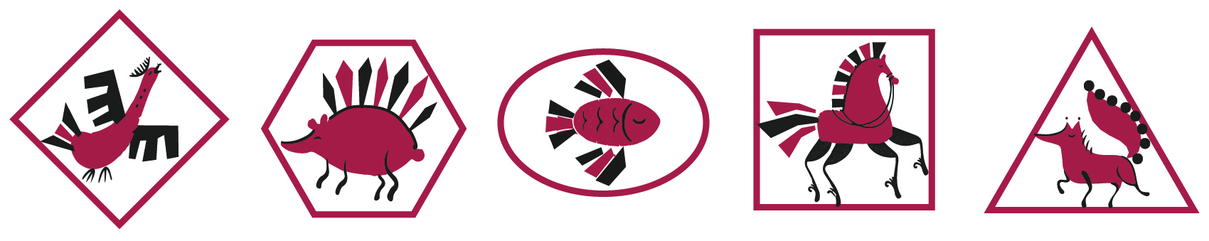


After all these stages of design development, the balance was found in minimum details, smooth forms and simple colours.
In these Game creation series we’ve unveiled to you some of the behind the scenes of the game creation process. As it is true to almost any area of activity that everything seems easy until you try it yourself, boardgames are not an exception. Creation process will always remain a mystery for many, but at least you’ve manage to catch a slight glimpse of how difficult, but still exciting, it might be.
We’ll be back with you on our next games.
Stay tuned!

